
Paper cup design starts with your counter
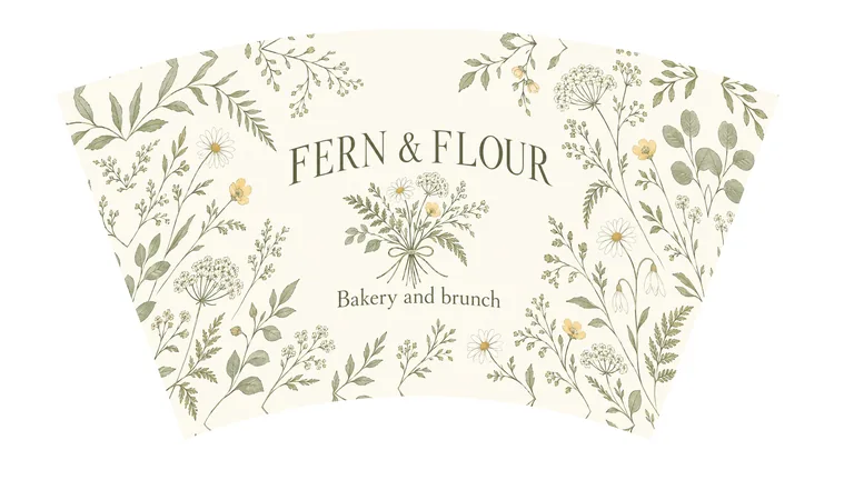
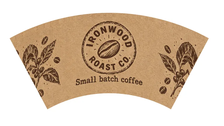
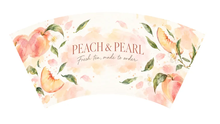
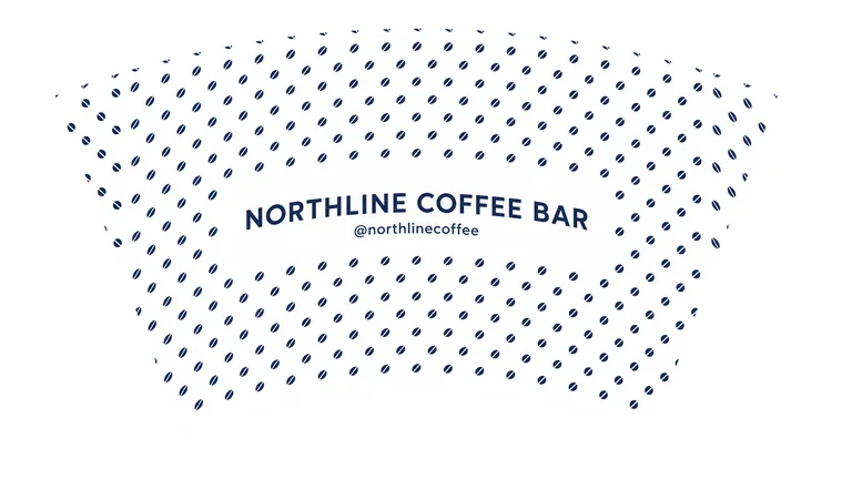
A good cup is built around the place that hands it over. A minimal espresso bar, a cozy bakery, a busy campus kiosk and a weekend market stand each ask for a different look, so describe the cafe, its customers and its mood before the decoration: “a quiet espresso bar with a small brown logo on cream” tells the generator more than “nice coffee cup”.
Then decide what the cup carries. Most cups hold the name and a mark, some a tagline or a handle, few much more: the front of a cup is about the width of a hand, and people read it while holding the drink. Keep the words you quote short, and let the rest of the cup be color, pattern or a picture.
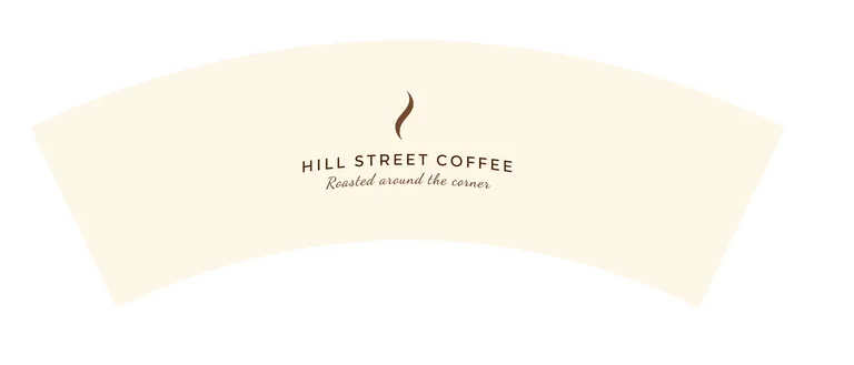
The cup above is in the cafe minimal style: a cream ground, the name small and centered on the front, a single curl of steam, and calm space that runs on round the back to the seam.